4.3. Population Scene
The Population Scene is the program’s visual output showing what is taking place within the defined simulation space. When the program is first started, or after a Reset is called, the Population Scene will default to showing a single coloured pixel in the centre of the population grid, unless Dual Reseed or 3- or 5-tier Trophic Reseed is selected is selected. By default this pixel represents the starting genome of the seeding organism: black pixels are those without any living digital organisms.
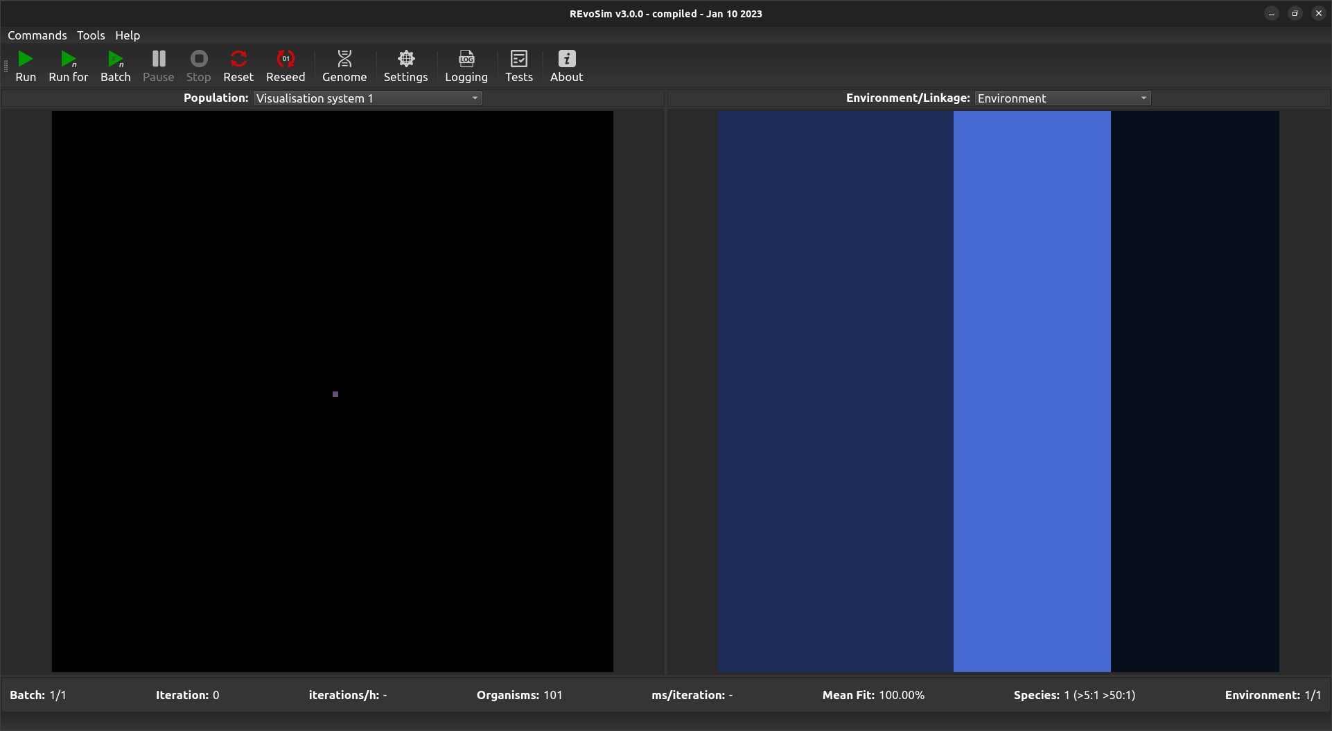
Default Population Scene showing a single starting genome in the centre.

Default Population Scene showing a two genomes, one on left and another on the right, as set by the Duel Reseed option.
The Population Scene can be set using the drop down menu to show different output modes, as shown below:
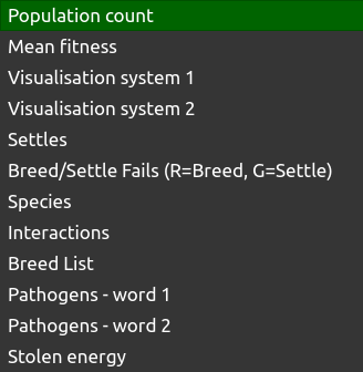
The Population Scene can also be saved as an image stack in order to e.g. create movies or analyse runs - see Configuring Outputs and Run End Log. Currently supported visualisation modes are:
4.3.1. Population Count

Each grid-square is visualized with a grey-level representing the current number of creatures alive in the square.
4.3.2. Mean Fitness
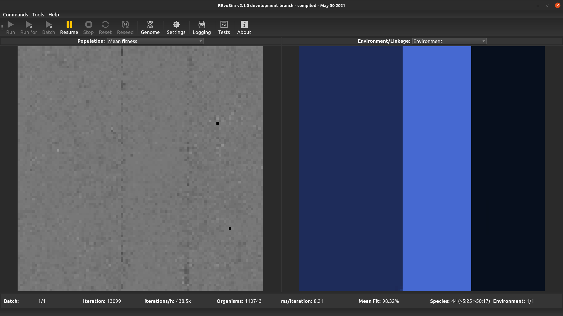
Each grid-square is visualized with a grey-level representing the mean fitness of all creatures alive in the square, scaled so that white is maximum fitness (=’Settle Tolerance’).
4.3.3. Visualisation system 1
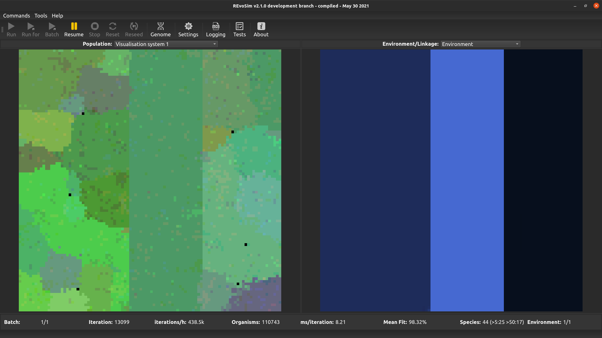
From v3.0.0 REvoSim features two visualisation systems for user-defined genome words. The words for each are set in the systems section of the Simulation settings docker. These both work in the same way: for each grid-square, the most commonly occurring (modal) sequence for the selected genome words is computed. These are then converted into a colour: e.g. for a single 32-bit word the level of red is the (scaled) count of 1’s in the least significant 11 bits, the level of green is the (scaled) count of ‘1’s in the next least significant 11 bits, and the level of blue is the (scaled) count of ‘1’s in the most significant 10 bits. The equivalent operation is applied if > 1 genome words are selected. This visualization approach provides a quick means of distinguishing sequences, ensuring that small genomic changes result in small changes in colour. It does not, however, guarantee that the same colour will in all cases represent the same genome (as many very different genomes may possess the same bit-counts in section of the genome words).
4.3.4. Visualisation system 2
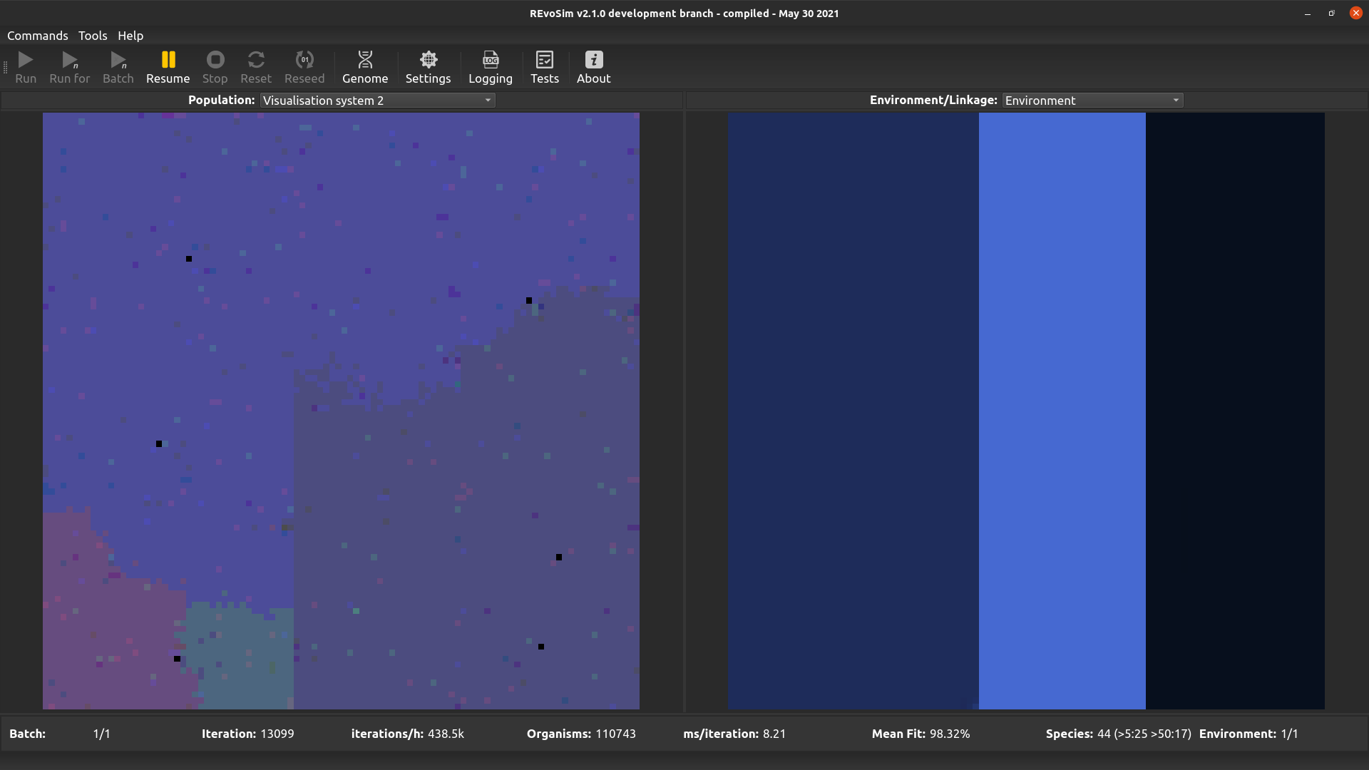
This operates in the same way as first visualisation system, but is included to allow two different word sets to be visualised (and saved as image stacks) if required.
4.3.5. Settles
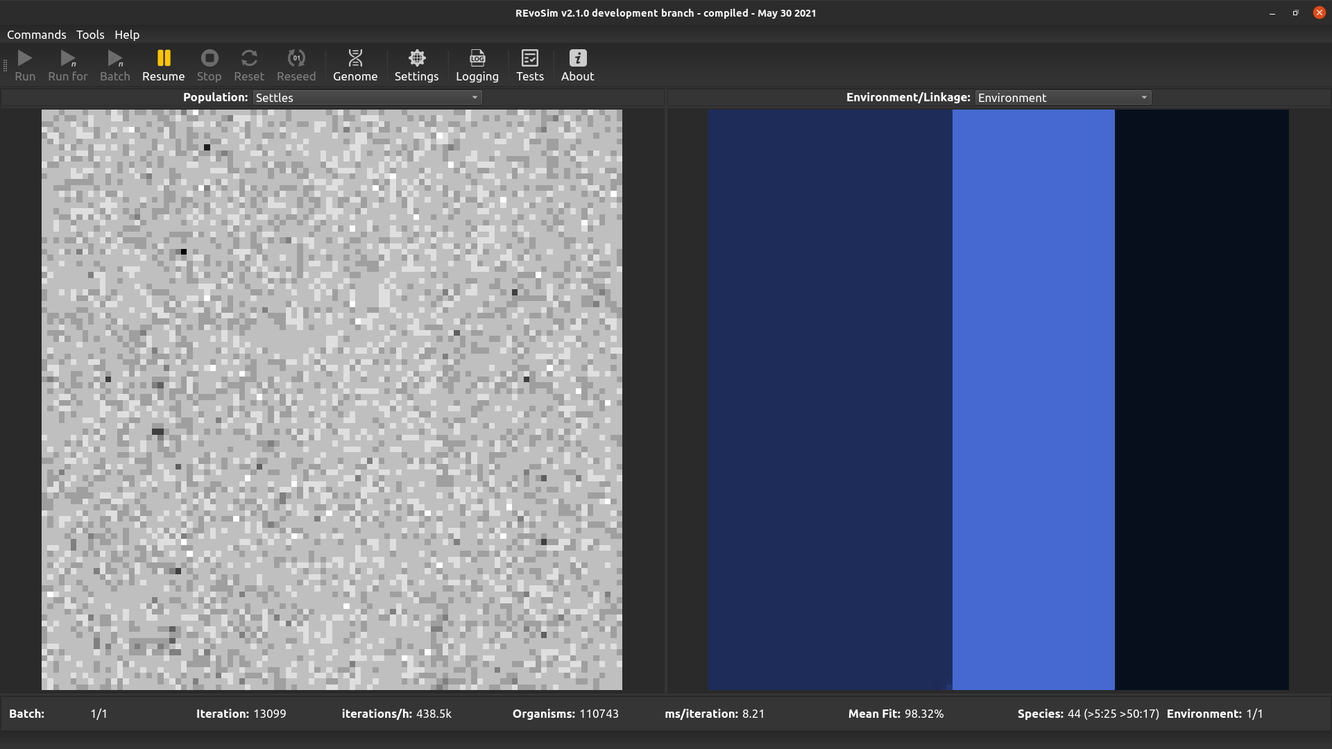
Each grid-square is visualized with a grey-level representing the number of successful ‘settling’ events in that square since the last visualization.
4.3.6. Breed/Settle Fails (R=Breed; G=Settle)
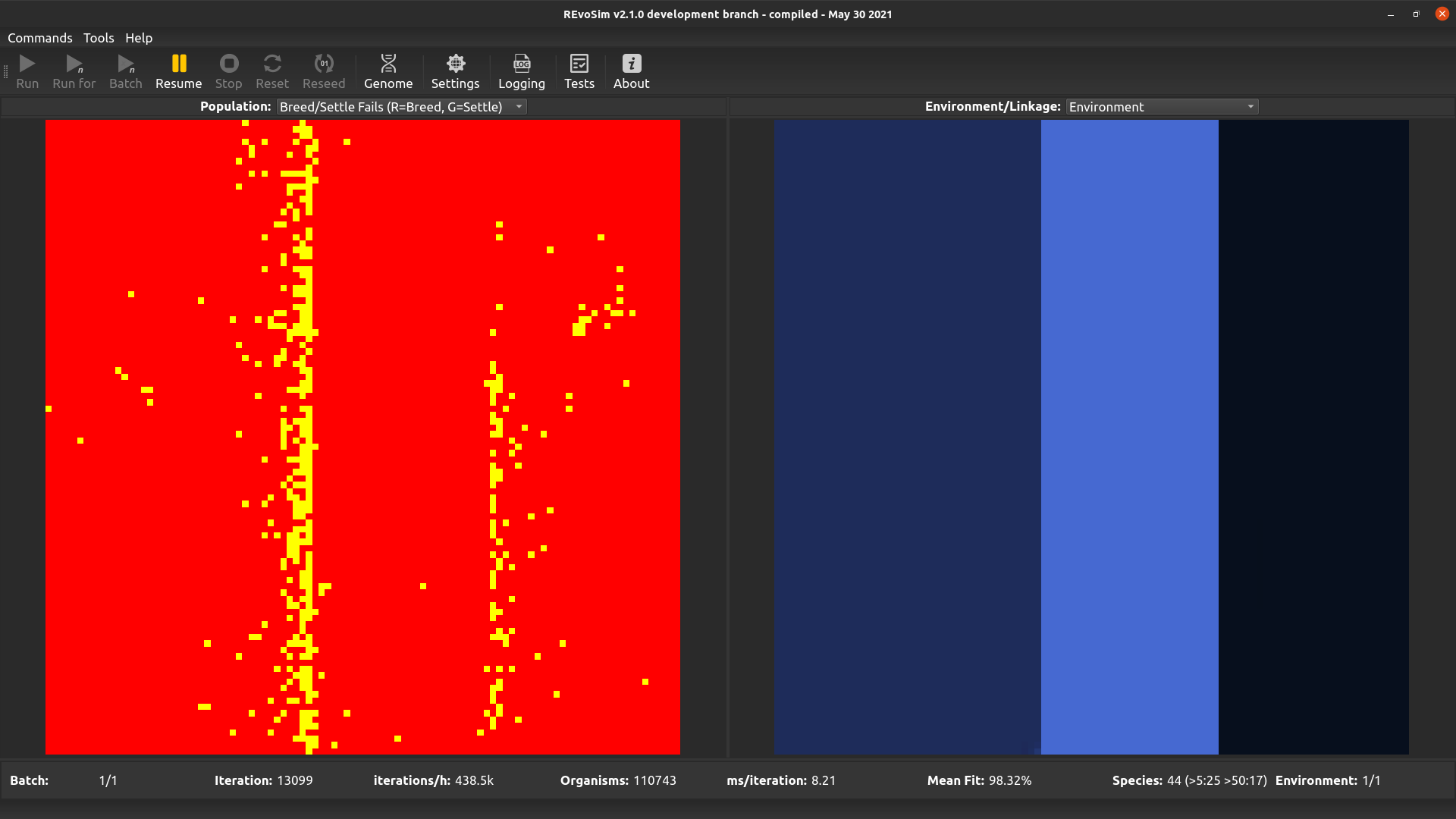
Each grid-square is assigned a colour representing the number of ‘fails’ since the last visualization. The number of ‘breed fails’ (attempts to breed that were aborted due to compatibility) provides the red level, and the number of ‘settle fails’ (attempts to settle that resulted in a fitness of 0 and hence the death of the settling creature) provides the green level. Fail visualizations are scaled non-linearly (using v = 100*f*0.8, where f = mean fails per iteration, and v is visualized intensity on a scale 0-255). Fail visualization maps the edge of species or subspecies ranges, as it highlights cells where gene-flow is restricted by any mechanism.
4.3.7. Species
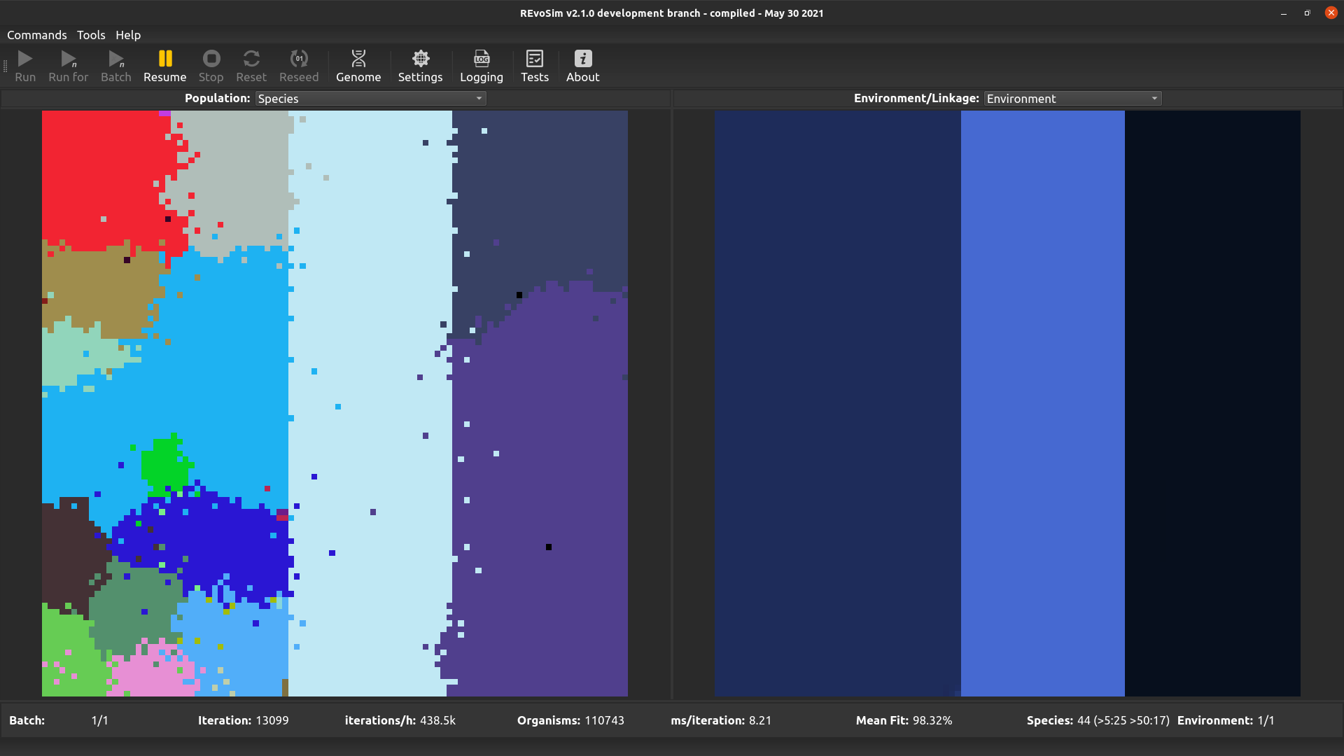
REvoSim simulations often produce discrete species, i.e. reproductively isolated gene-pools, and for many macroevolutionary studies the identification and tracking of the fate of species is a requirement. This visualisation option assigns a unique colour to each species, and colours each grid-square with the species in the lowest occupied slot of that square.
4.3.8. Interactions
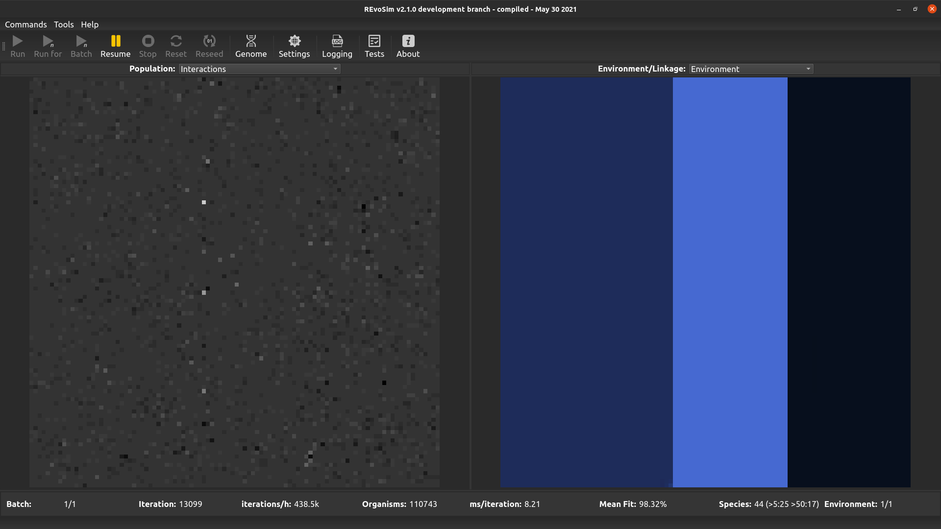
This option visualises the difference between the environmental fitness of the first organism in a grid-square, and the total fitness of that organism including interactions. It thus provides an easy overview of the impact that interactions are having on fitness when interactions are set to modify organism fitness values.
4.3.9. Breed list
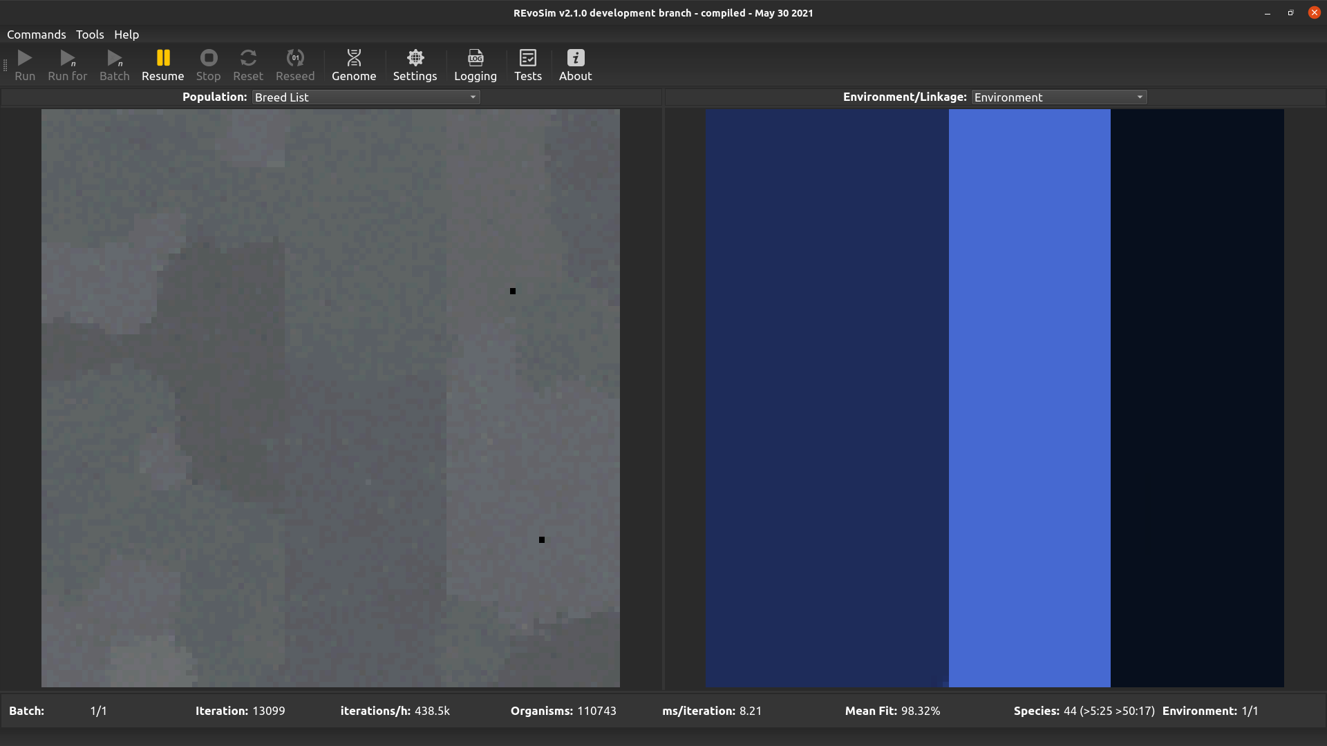
This visualises the breed list, and is of the greatest utility when multiple breed lists are enabled (the following calculation is applied even when multiple breed lists are not enabled). When selected, every organism in a cell is inspected to determine the breed list that it is using, and the index of the most frequent breed list is used to determine the colour intensity of the red channel, the second most for green, and the third for blue. As such, cells with organisms placed in just one breed list are pure red; cells with a single but established dominant genome are grey (the 2nd and 3rd most frequent breed list are on either side of the breed list for that dominant genome, due to jitter, and their similar index values will result in similar intensities in all three colour channels); and cells with more than one dominant genome will be coloured (the different breed lists for those genomes result in different intensities in the colour channels, creating non-grey pixels).
4.3.10. Pathogens word 1
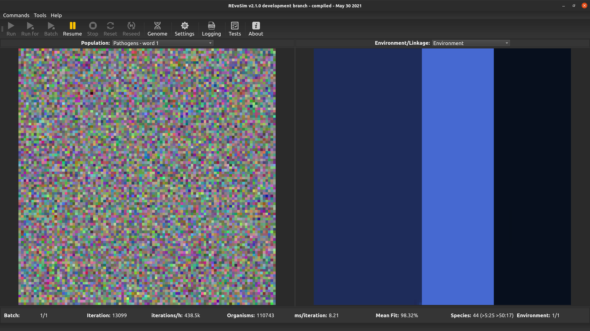
This option allows pathogens to be visualised - it follows the same approach as the visualisation systems, albeit with hard coded pathogen words. If flexibility is required, please request this. This option visualises the first word of the pathogen genome.
4.3.11. Pathogens word 2
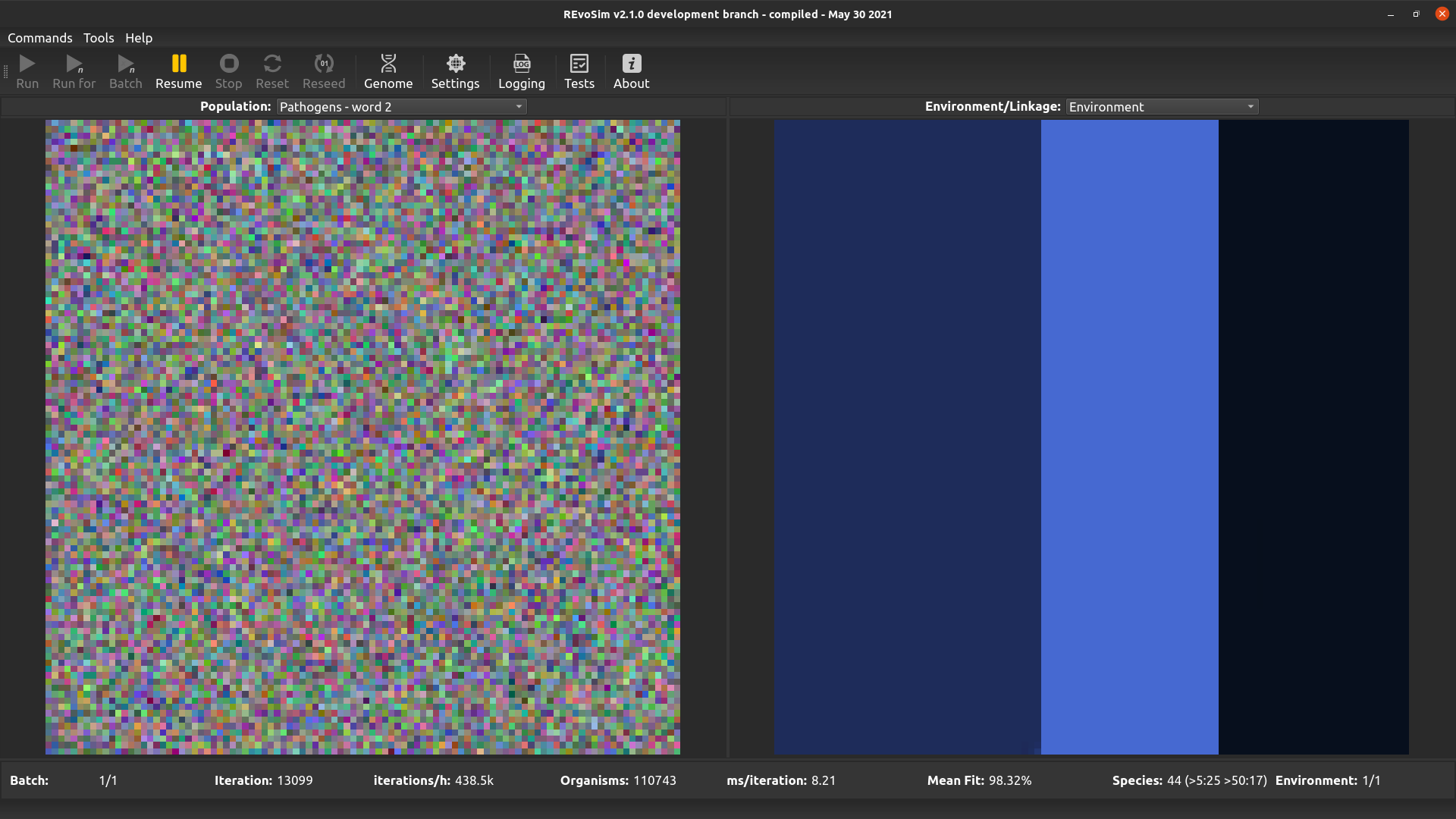
This option is the same as the above, but visualises the second word of the pathogen genome.
4.3.12. Stolen energy
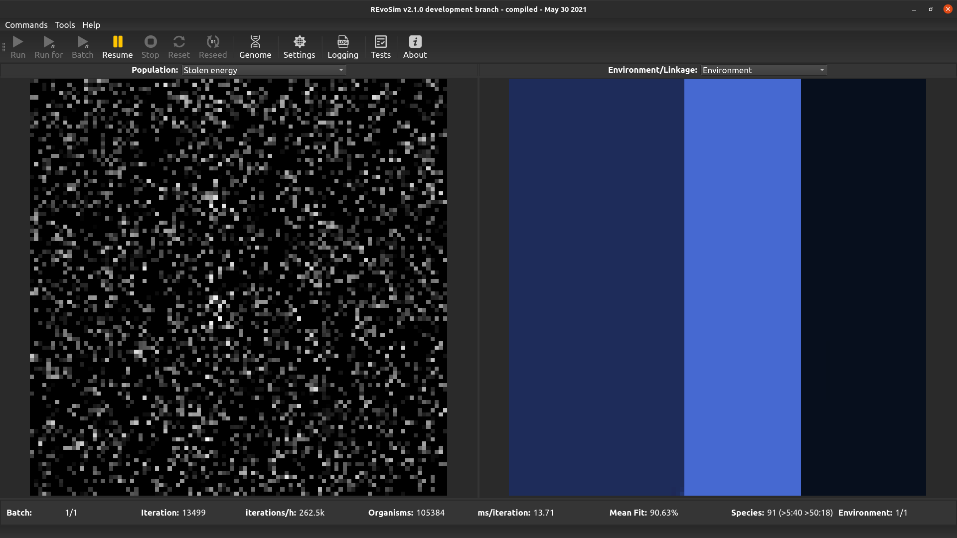
This option visualises the proportion of the total energy collected over the lifetime of the first organism in each cell that was stolen using the interactions system (if enabled), as opposed to being sourced from the fitness algorithm. White pixels represent organisms that have obtained all of their energy through interactions with other organisms.